Branding & Packaging for Crave Essentials
Crave Essentials needed a brand that could stretch across an entire pantry, snacks, candy, nuts, cold brew, cold-pressed juice, and water, without losing its personality. I designed the identity around the bouncy "crave" wordmark and an "essentials" sub-mark, then built a flexible packaging system that gives every category its own color world while keeping the brand instantly recognizable on shelf and in hand.
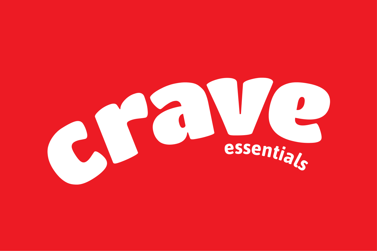
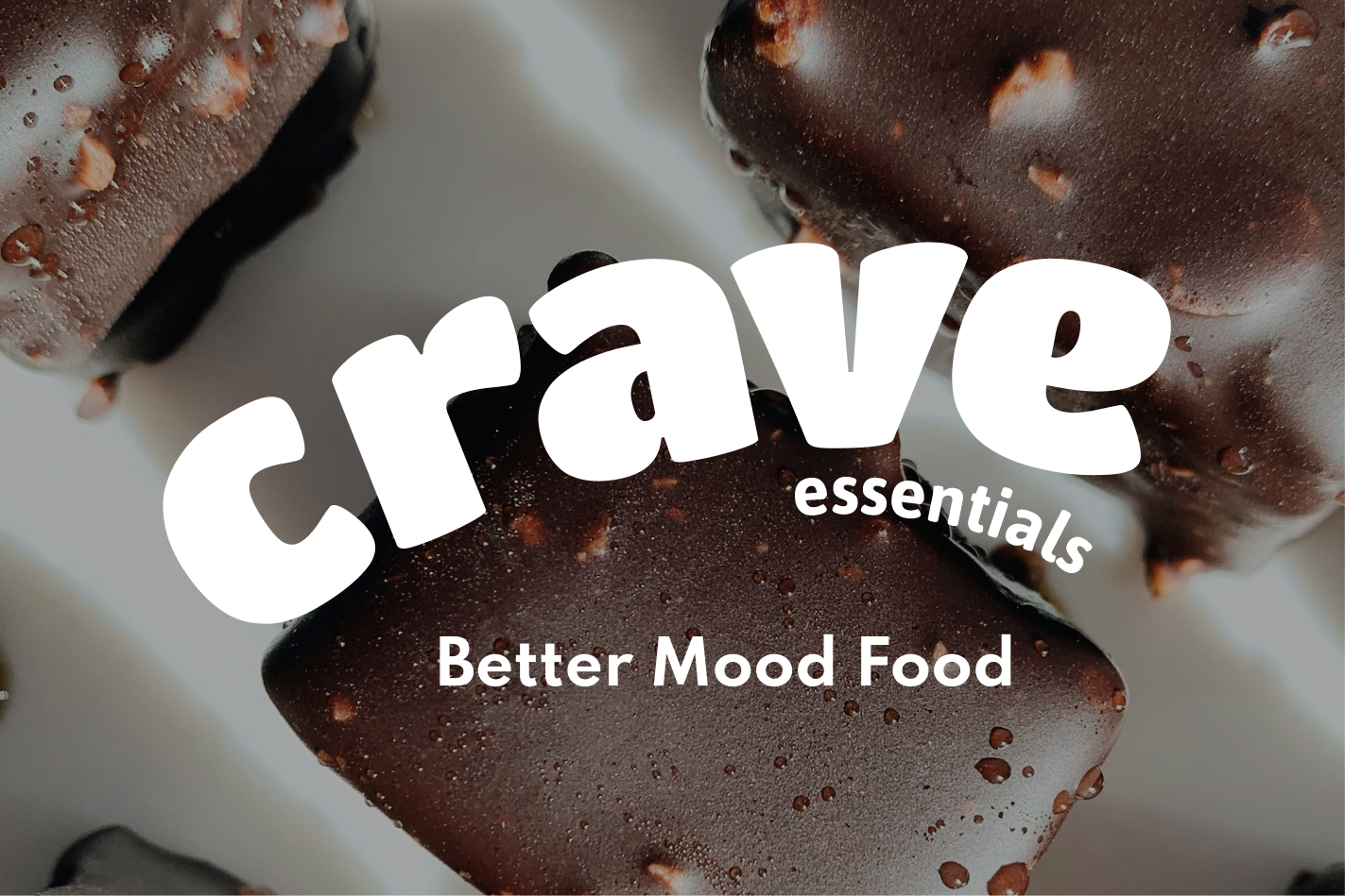
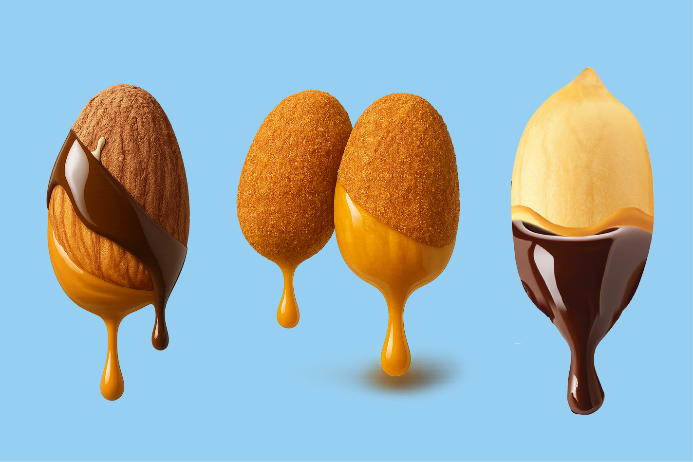
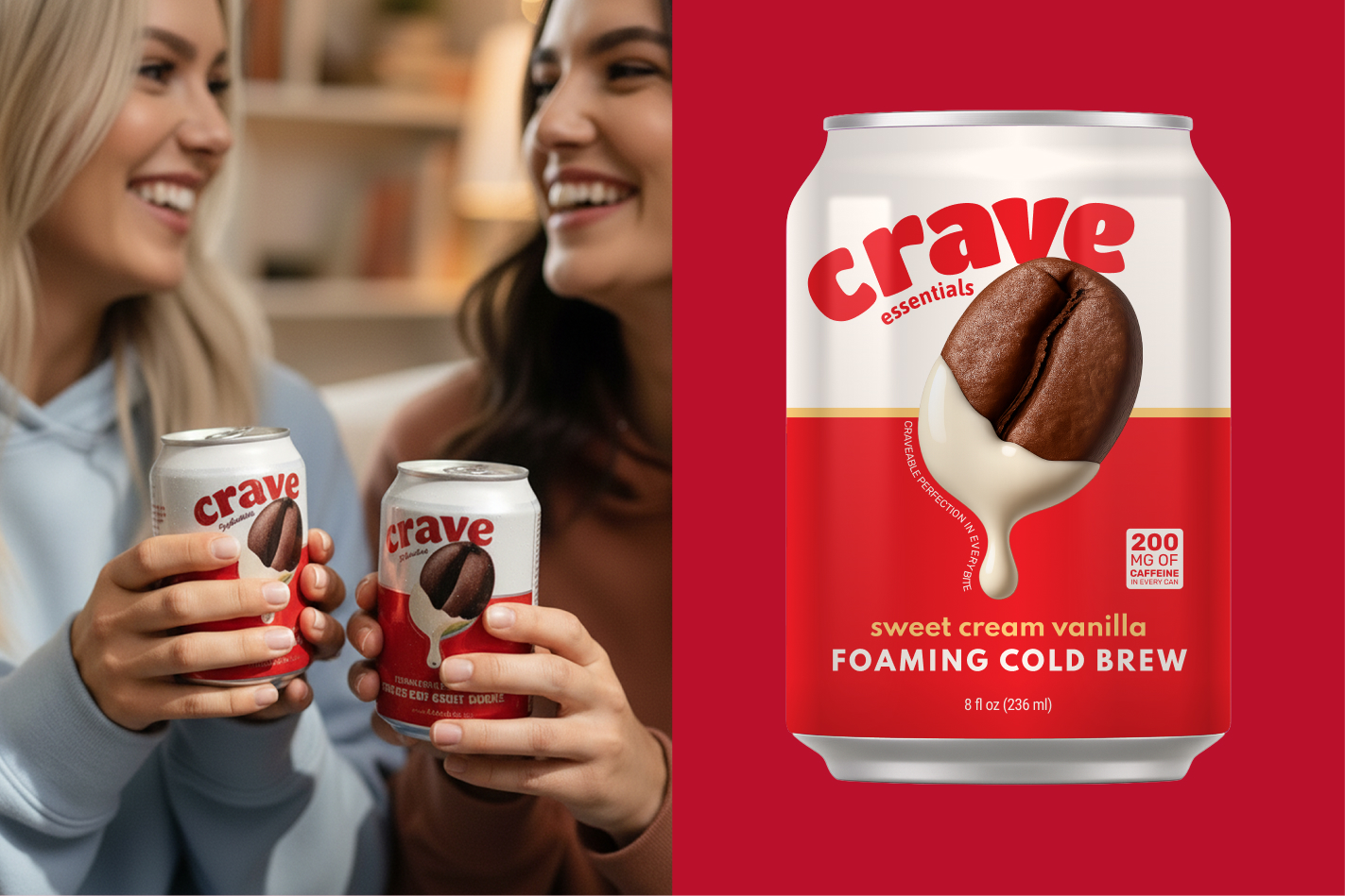
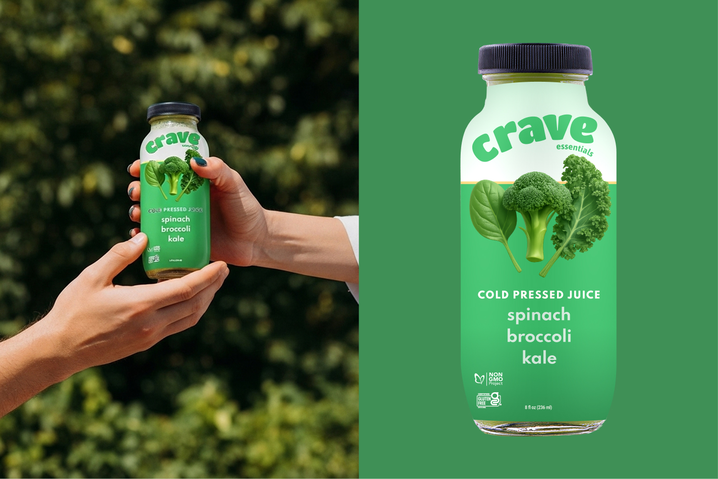
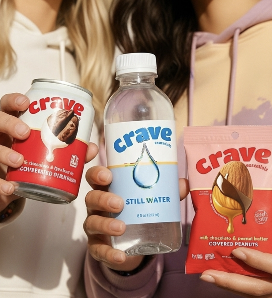
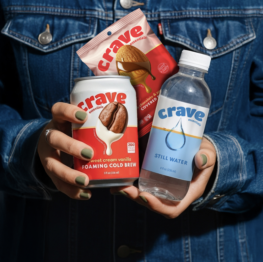
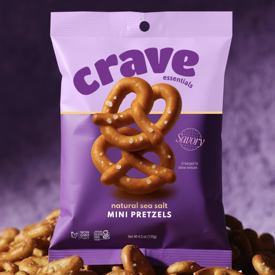
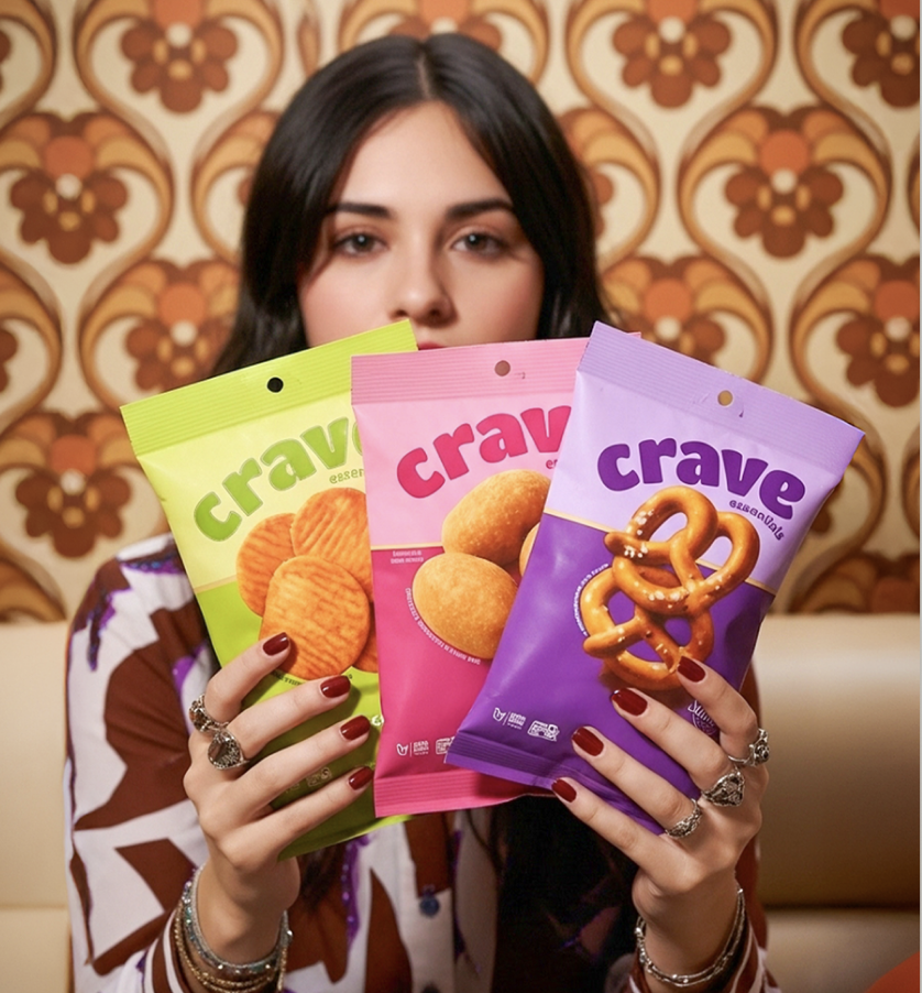
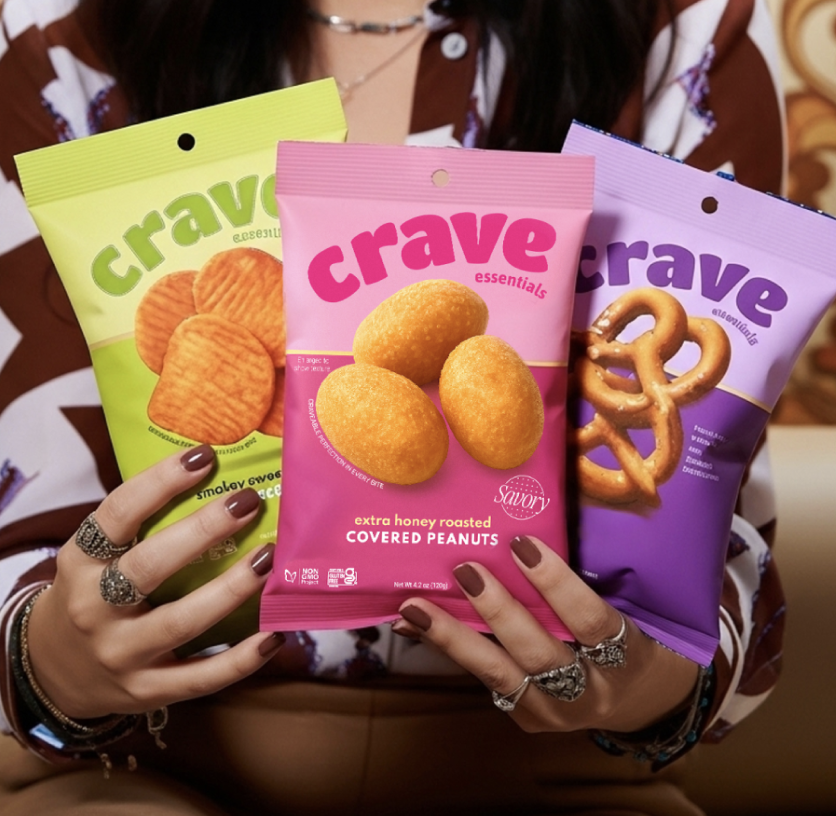
Designed the Crave Essentials identity around a bold, rounded wordmark, friendly enough to feel craveable, confident enough to anchor a full product range, paired with a clean "essentials" sub-mark and the "Better Mood Food" brand line.
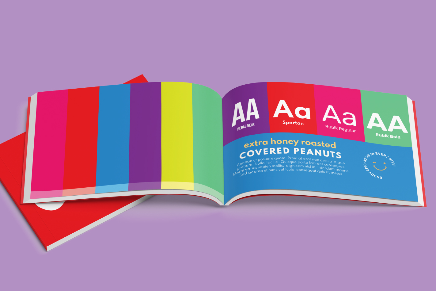
Built a brand guide that codifies the system: a saturated multi-color palette, a type hierarchy pairing Bebas Neue, Spartan, and Rubik, and playful supporting cues like the smiley "enjoy epic-ness in every bite" stamp, so the brand stays consistent as new SKUs launch.
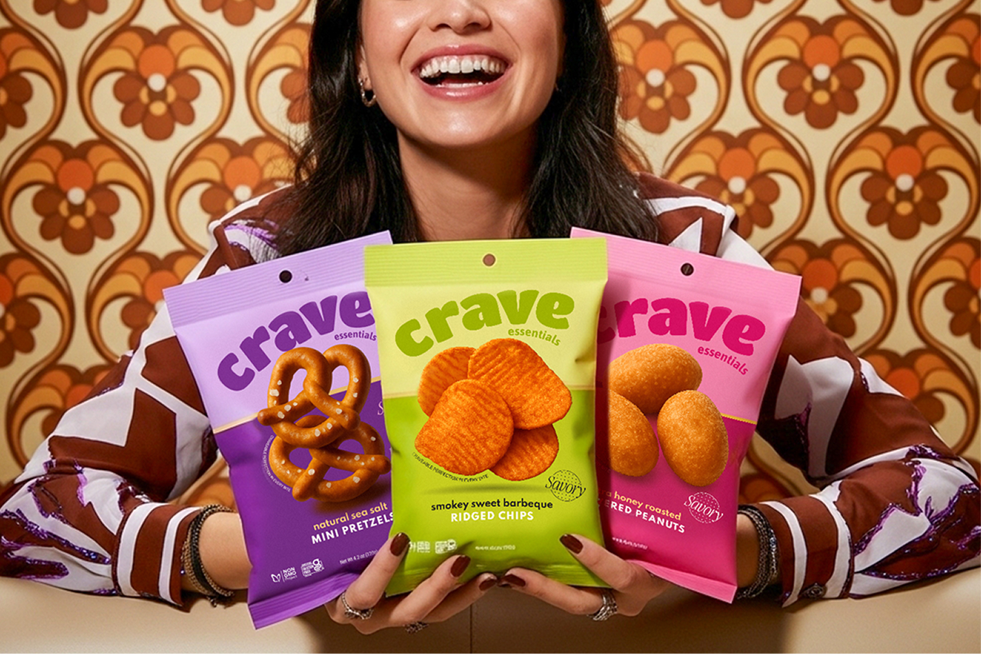
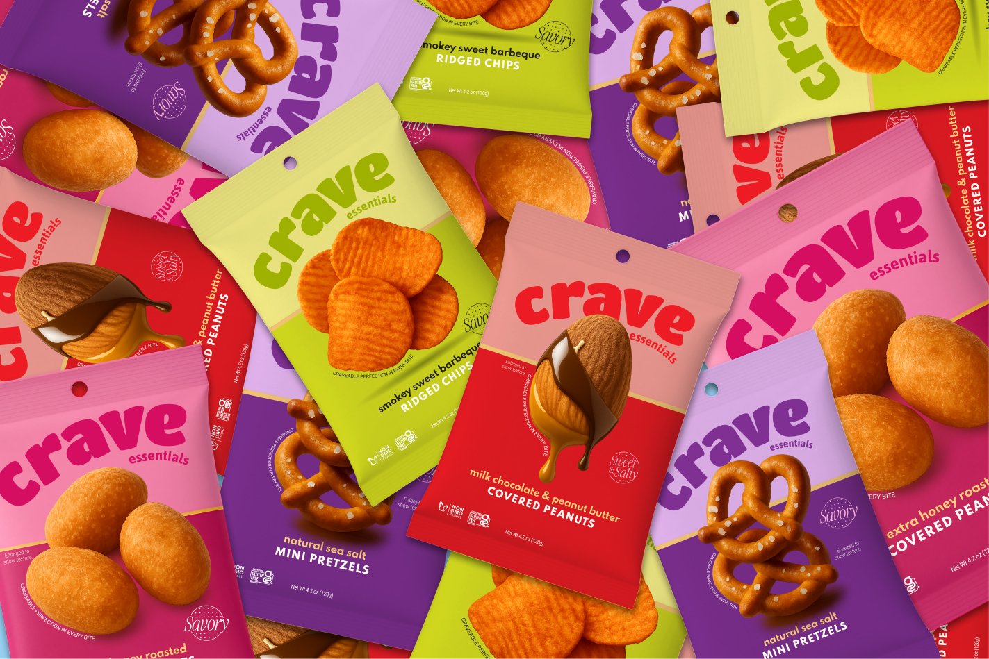
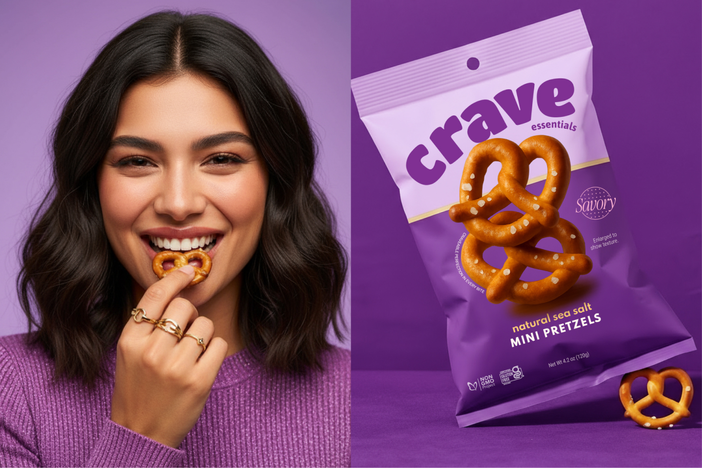
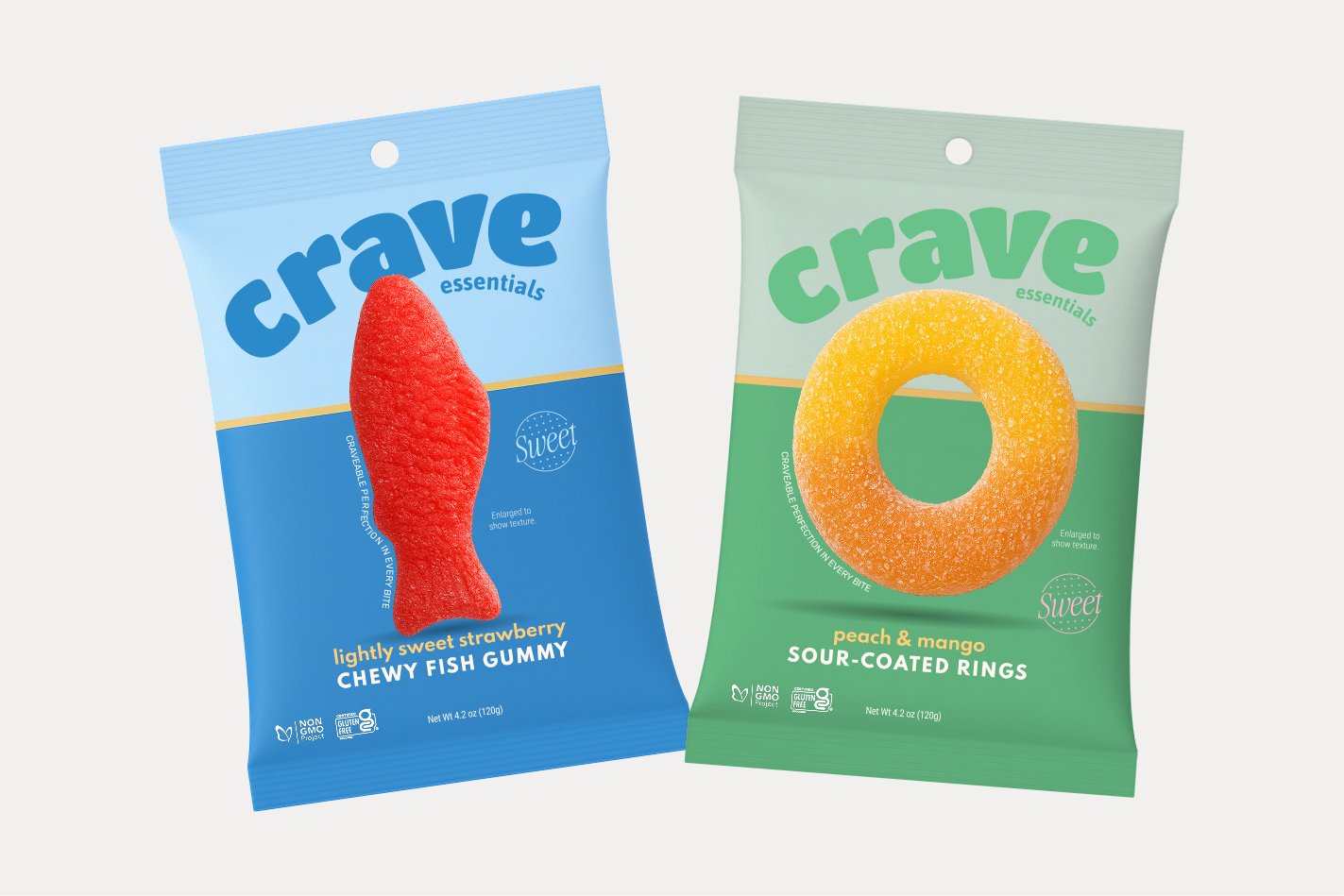
Created a flexible packaging architecture that color-codes each line, purple sea-salt pretzels, green BBQ ridged chips, pink honey-roasted peanuts, blue and green gummy candy, and a warm red cold brew, while a shared layout (curved logo, gold divider, hero product photo, Sweet/Savory badge) keeps every bag and can unmistakably Crave.
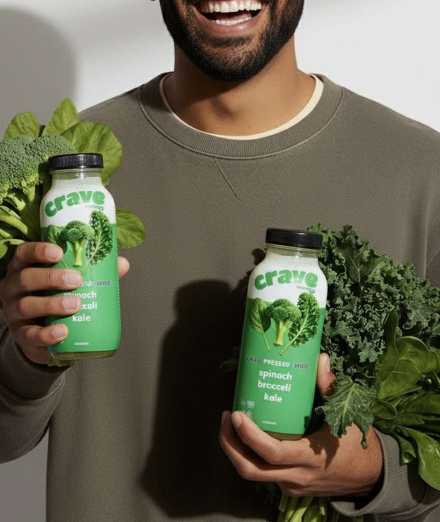
Extended the system across formats beyond snacks: a "sweet cream vanilla Foaming Cold Brew" can, "Still Water" and "Cold Pressed Juice" bottles, and chocolate-covered nuts, proving the brand world holds up across cans, bottles, pouches, and bags.
Art directed lifestyle and product photography, retro-wallpaper snack moments, denim-jacket grab shots, and dripping ingredient hero imagery, to give the brand a cohesive, appetite-driving visual library for packaging, e-commerce, and social.