
Kind Patches Website + PDP + Cart Makeover
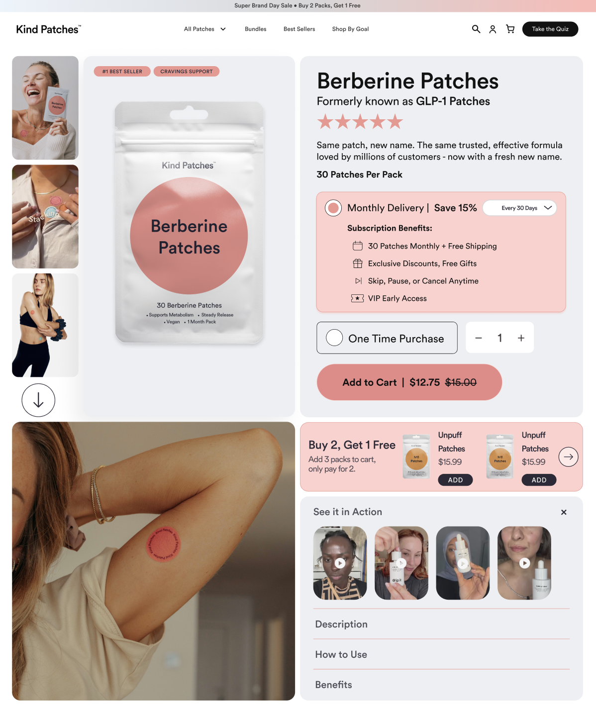
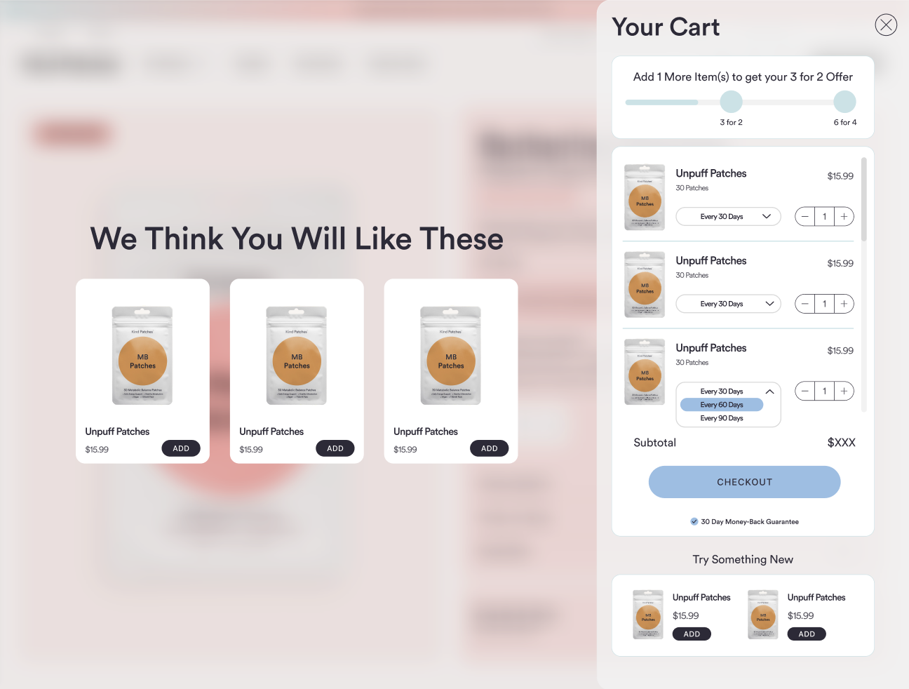
Reimagined the full Kind Patches shopping experience, from homepage to product detail page to cart, into one cohesive, conversion-focused flow. The redesign leads with a clear benefit-driven hero, reinforces trust through social proof and press, and streamlines the path to purchase with a subscribe-and-save model and bundle offers.
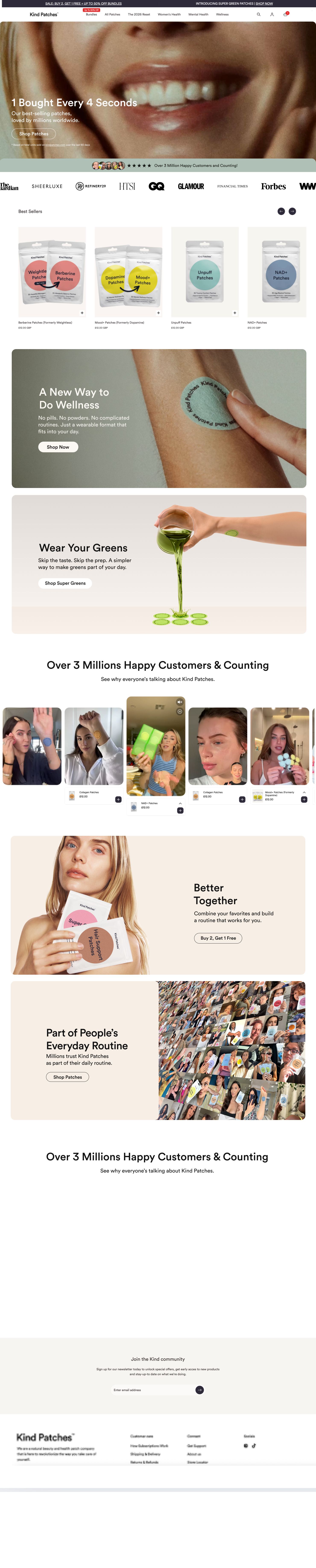

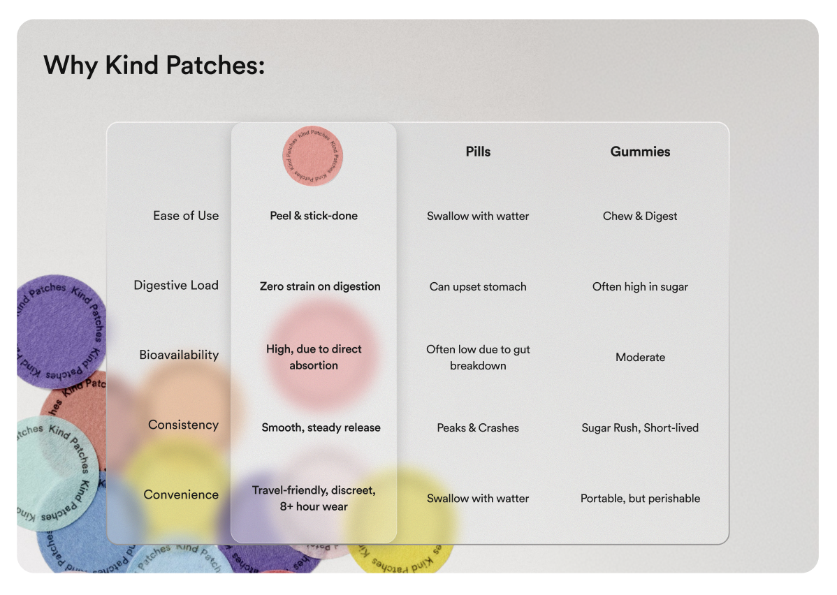
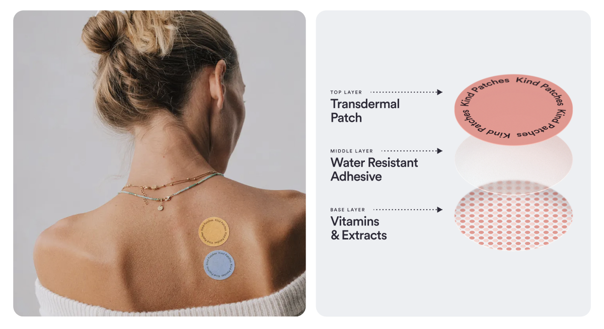
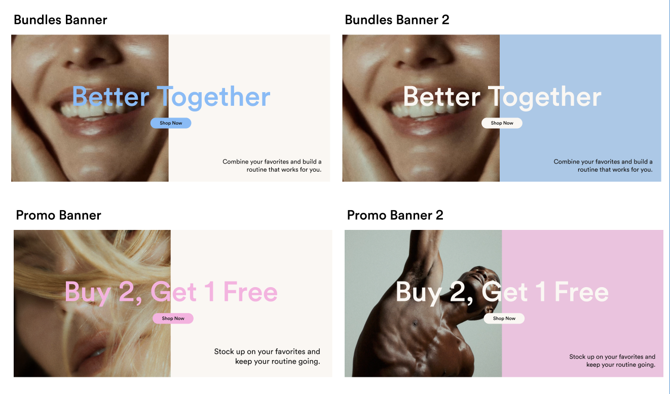
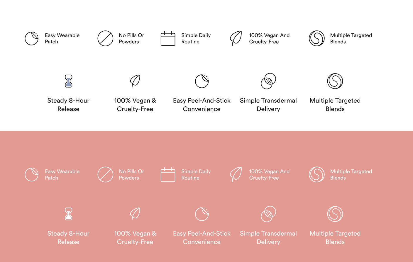
Rebuilt the homepage around a single, confident promise, "Weight Loss Support, without injections.", paired with lifestyle photography, a trust bar, and quick benefit callouts that frame the product in seconds.
Added a press and credibility row beneath the hero so social proof does the heavy lifting early, with star ratings and customer counts reinforcing trust before the visitor scrolls.
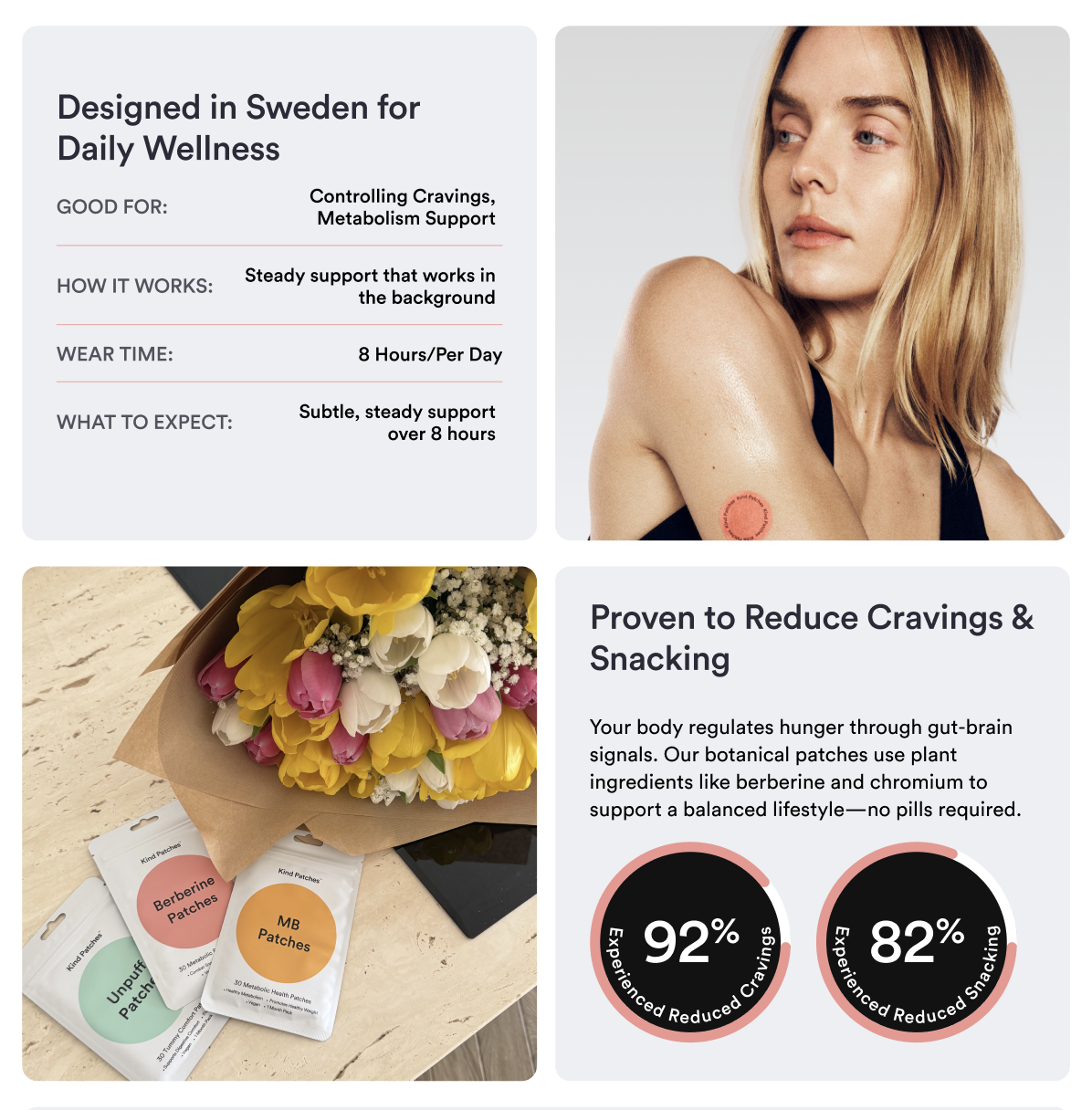
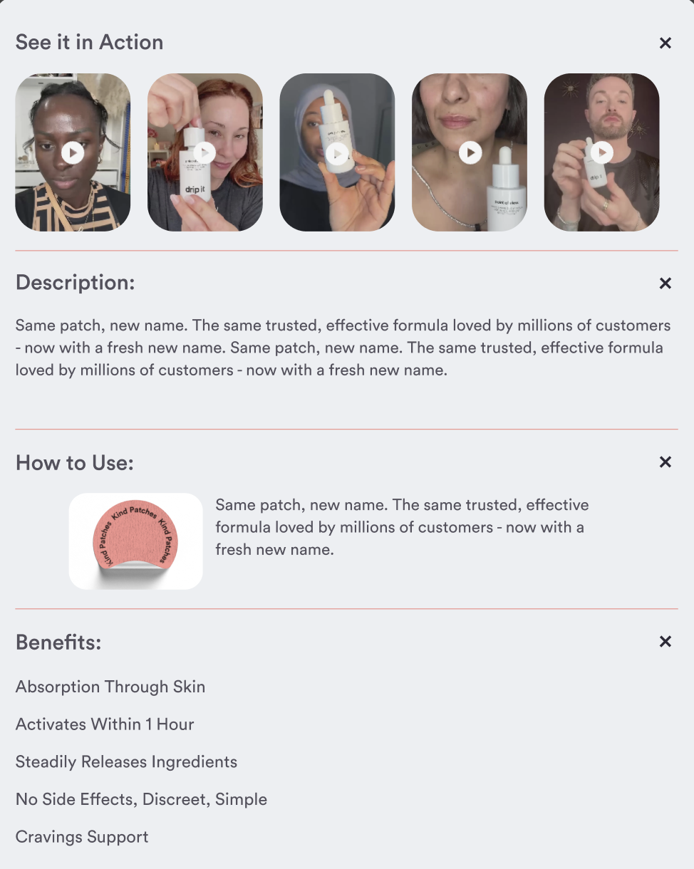
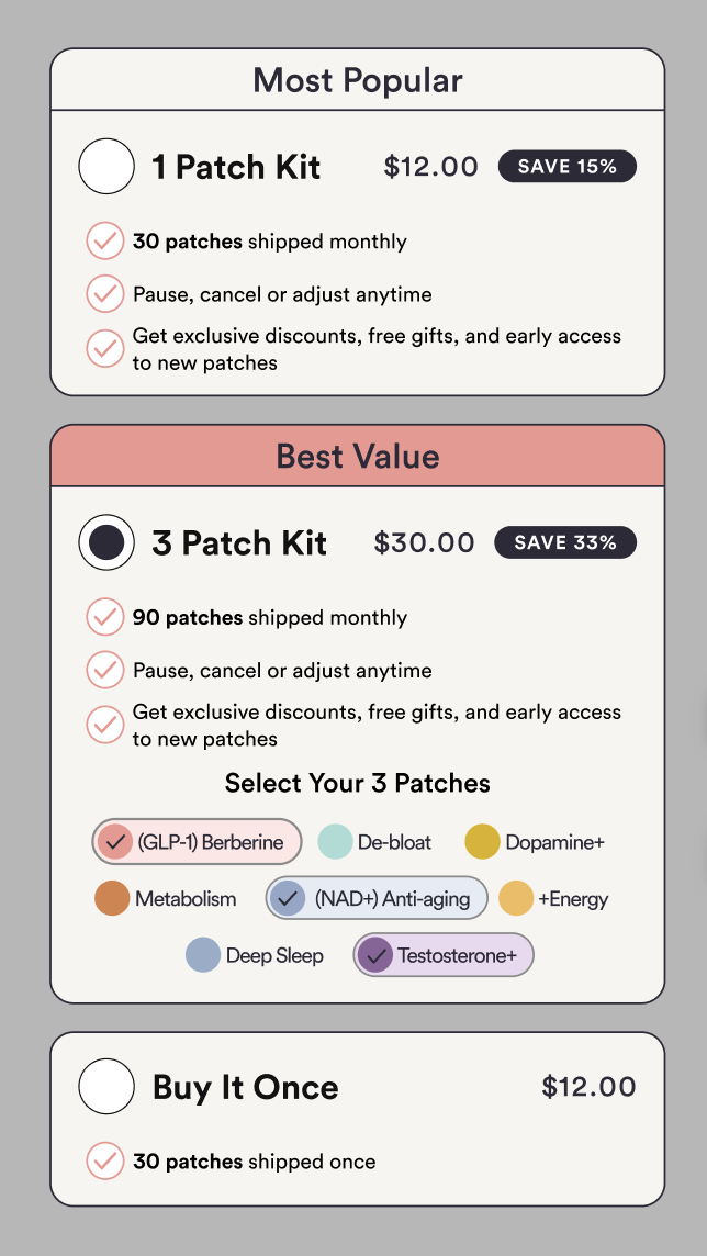
Designed the product detail page to merchandise bundles and subscriptions side by side, "Buy 2, Get One Free", subscribe-and-save pricing, and a clean ingredients / why-you-will-love-it accordion that keeps dense info scannable.
Streamlined the cart and add-to-cart experience into a focused, low-friction flow that surfaces savings and the recurring-order value without burying the primary CTA.
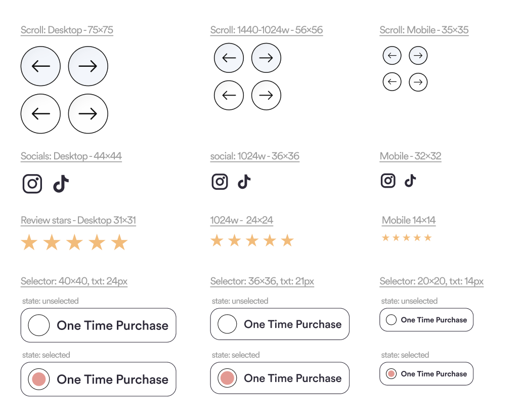
Tied the whole system together with a warm, approachable visual language, soft pinks, friendly type, and generous spacing, so the storefront feels premium and trustworthy across desktop and mobile.