
Amazon Design for MaryRuth
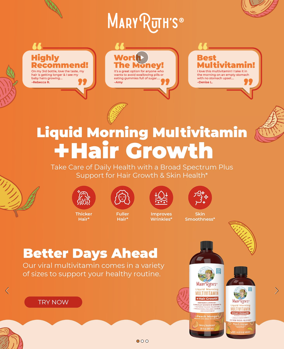
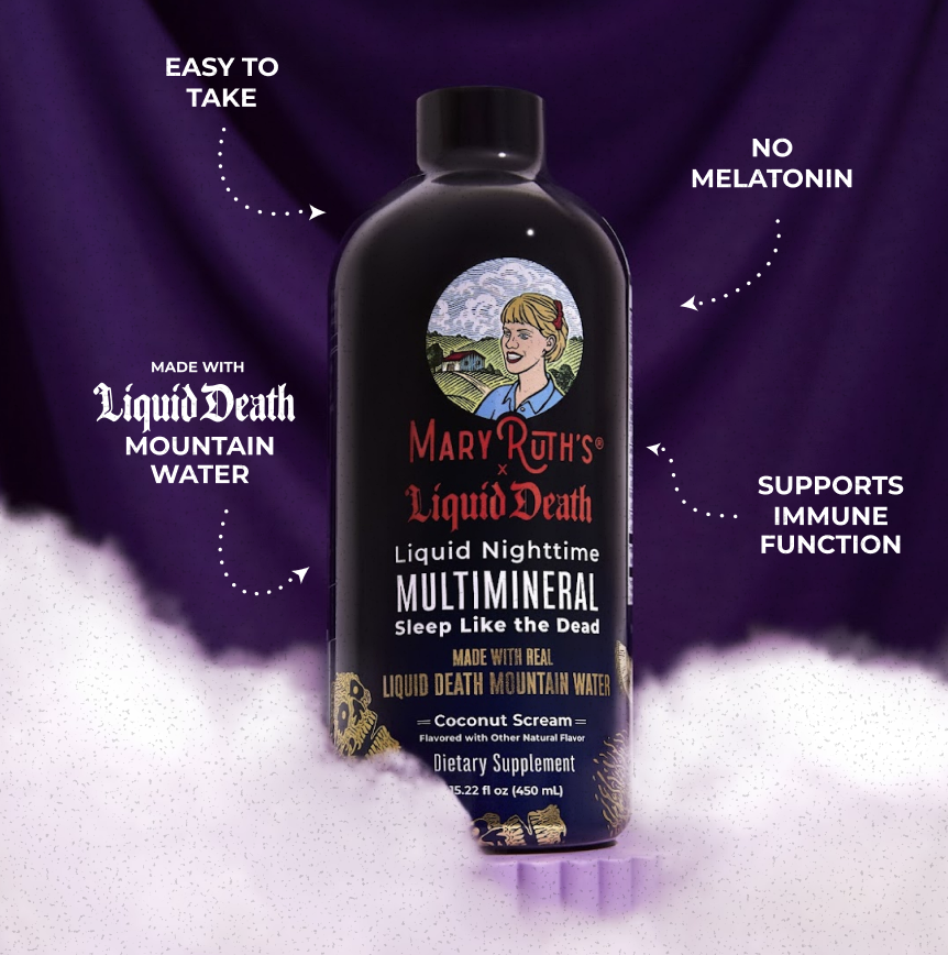
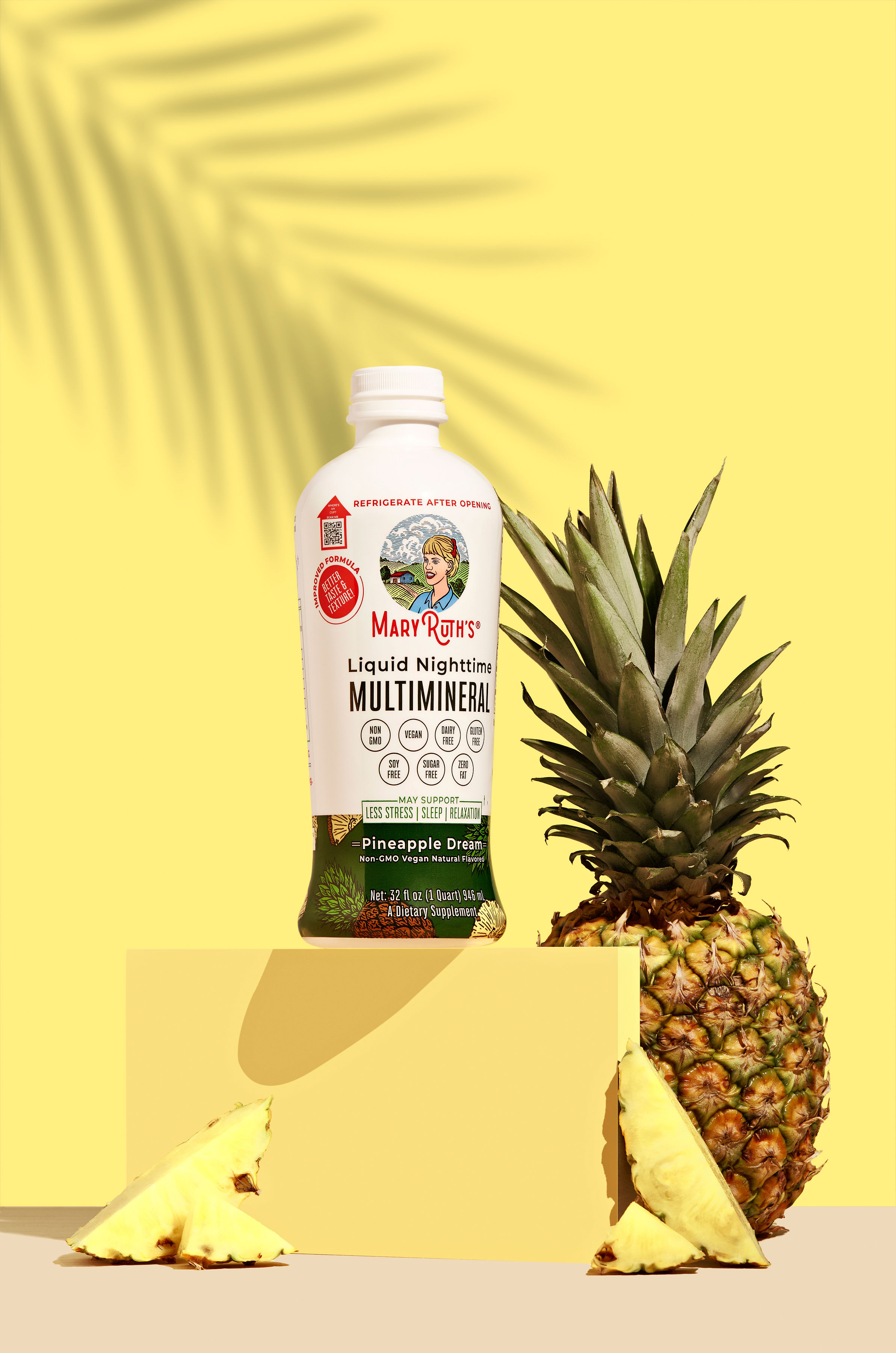
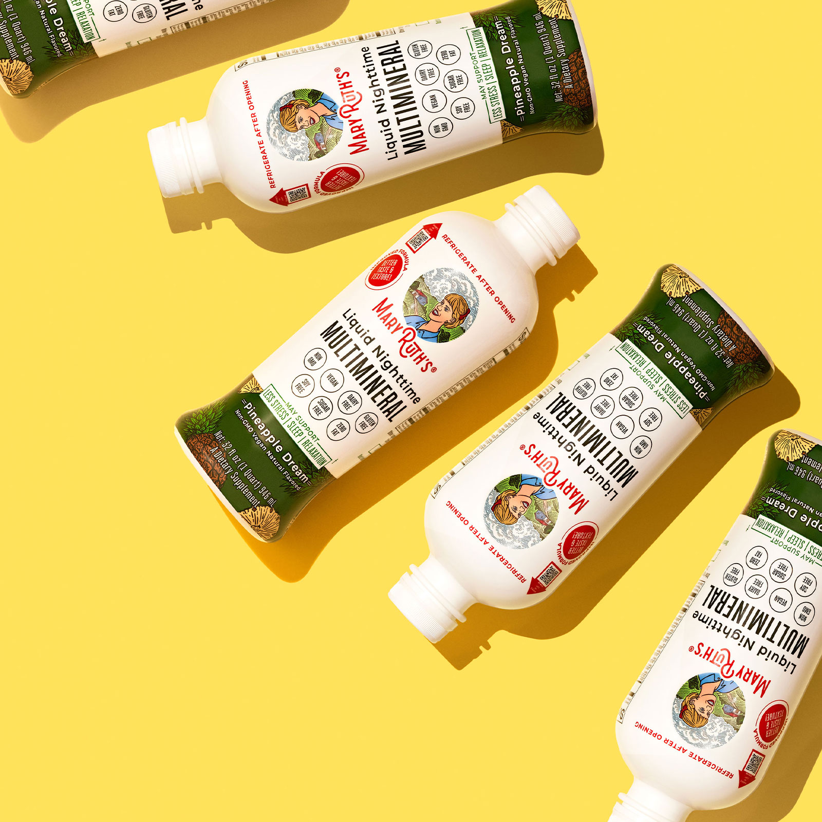
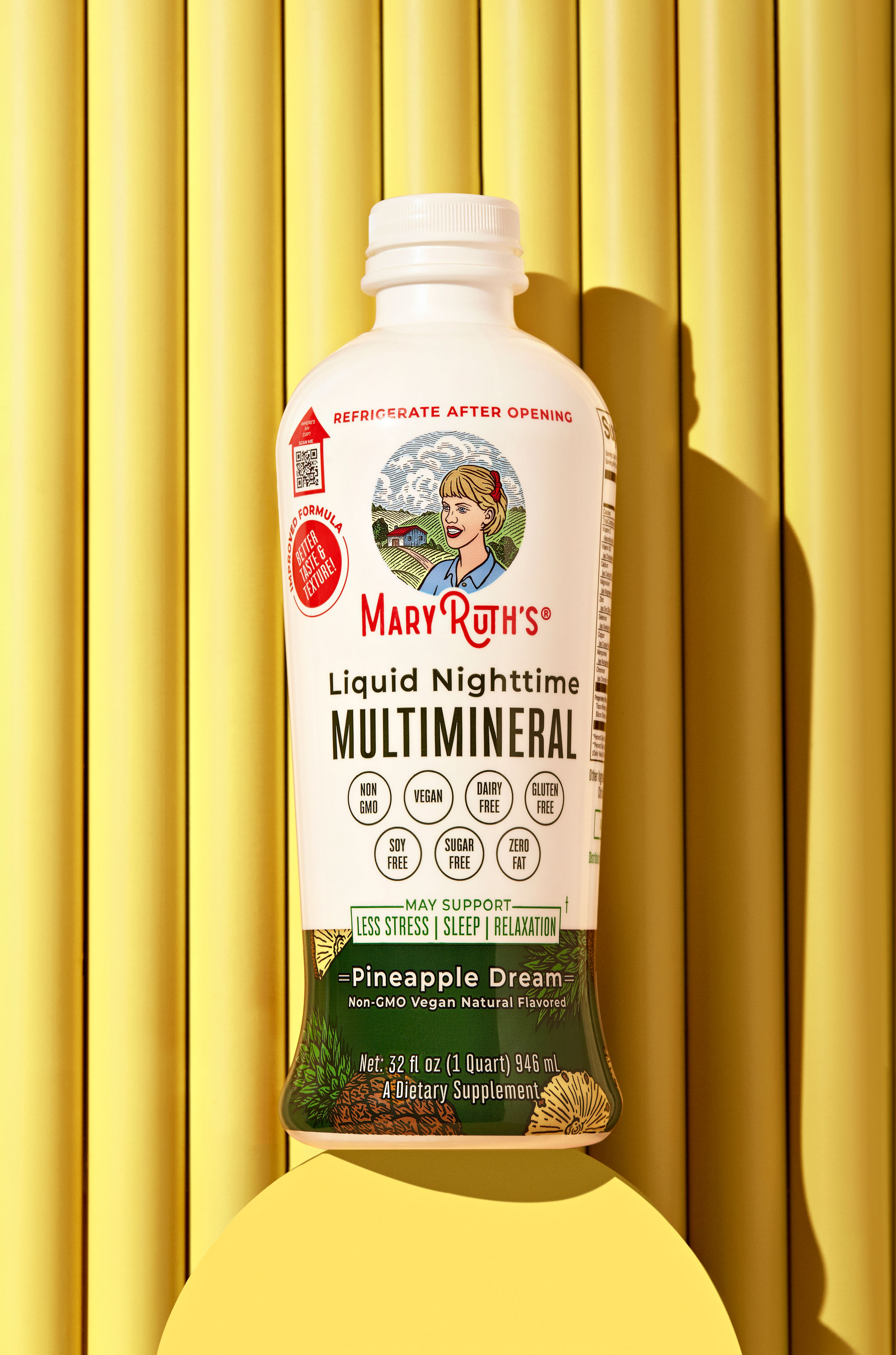
Designed the Amazon presence for MaryRuth Organics across the liquid supplement catalog, building image stacks, A+ content, benefit-led PDP layouts, and the branded storefront. Each product carries its own color story, raspberry for the Morning Multivitamin, purple for the Liquid Death collab, yellow for Pineapple Dream, within a consistent system of hand-drawn fruit illustrations, certification badges, and bold editorial type.
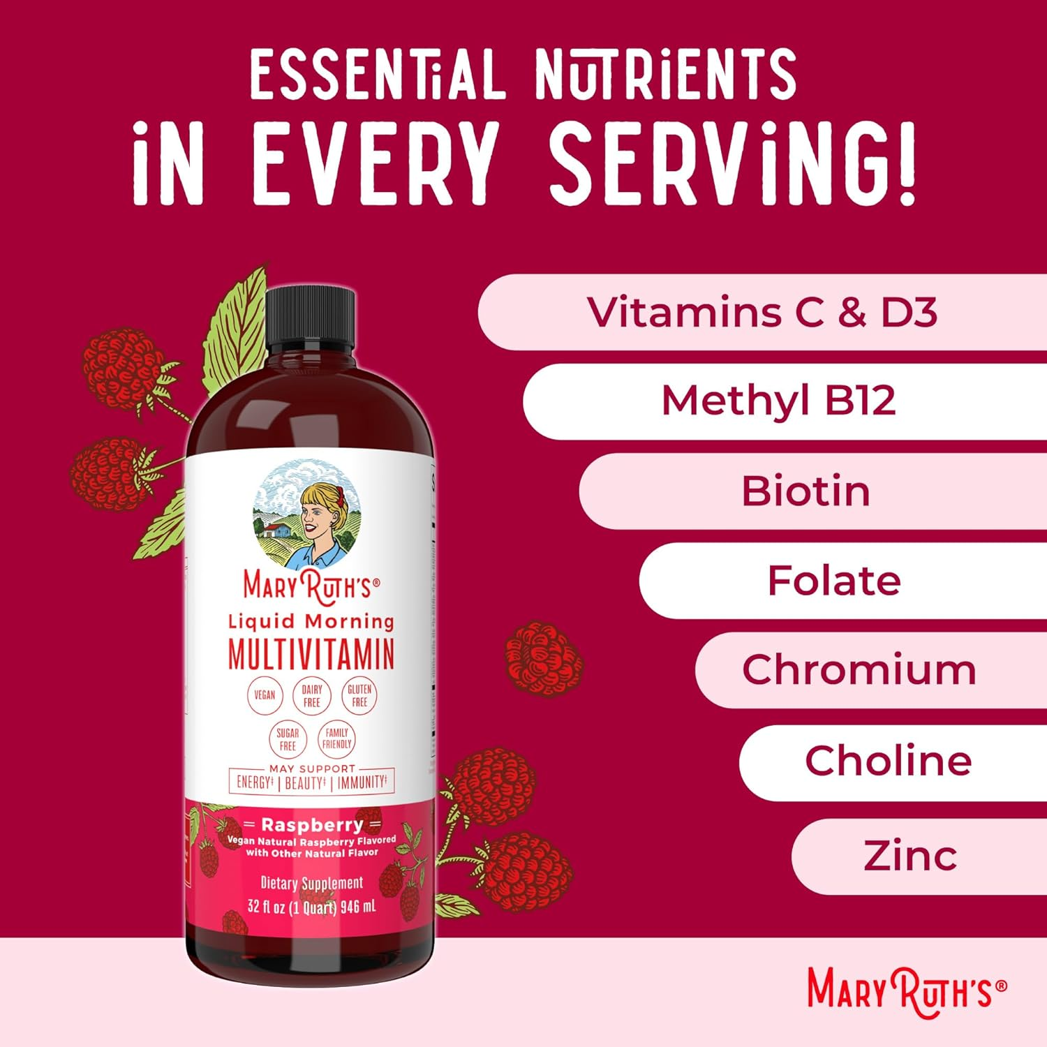
Built ingredient-forward PDP frames like "Essential Nutrients in Every Serving," spotlighting the morning multivitamin’s key vitamins and minerals in clean callouts against the brand’s raspberry palette.
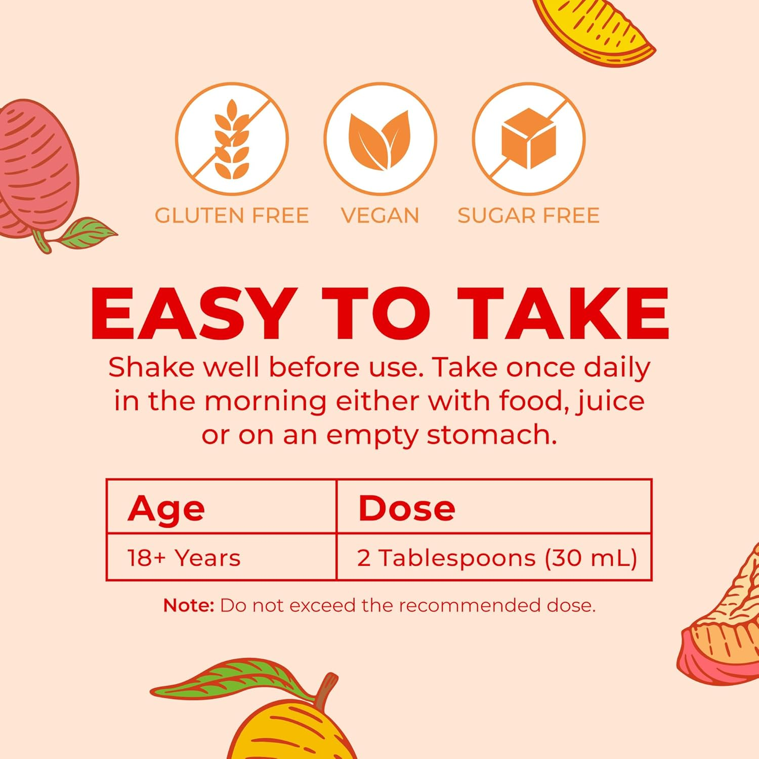
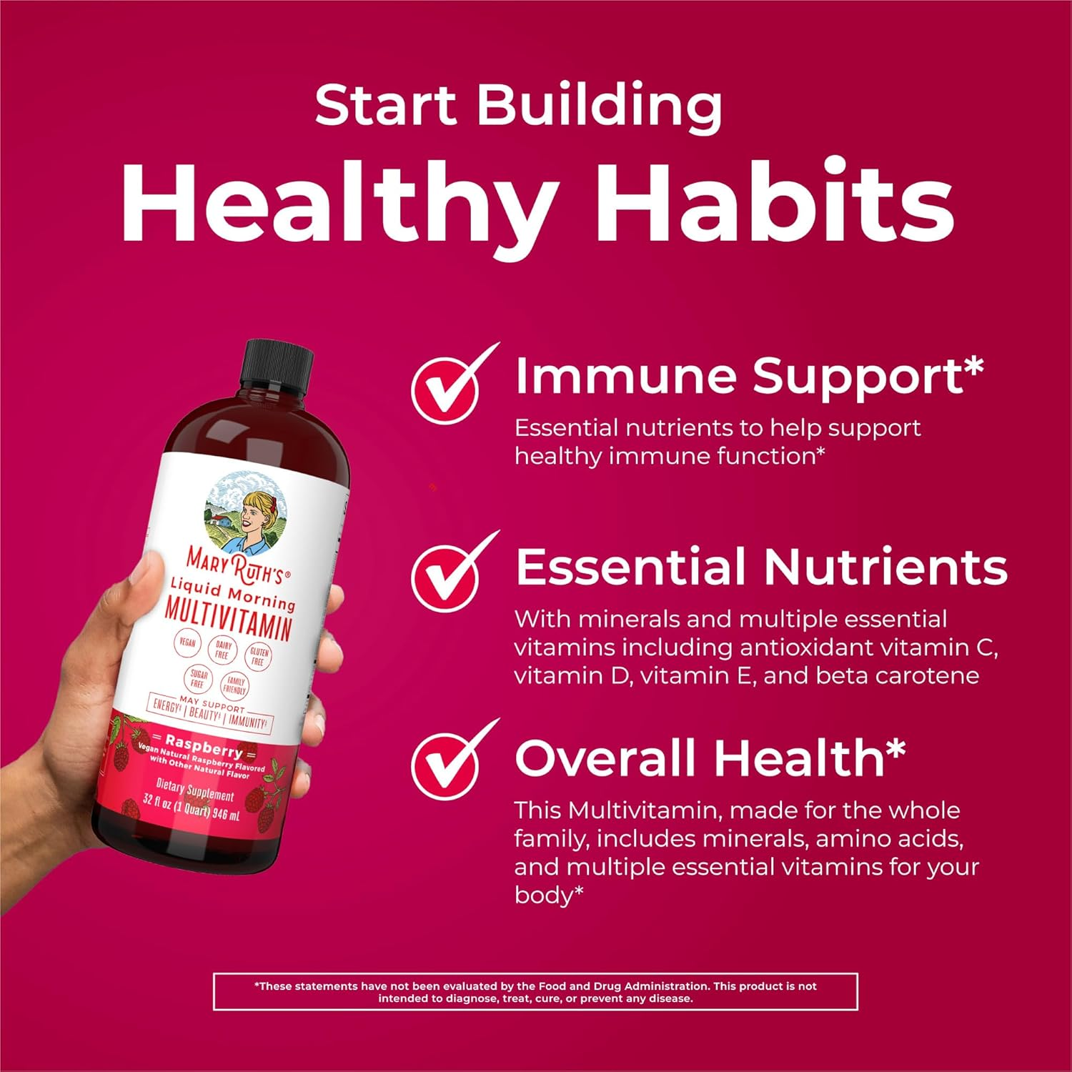
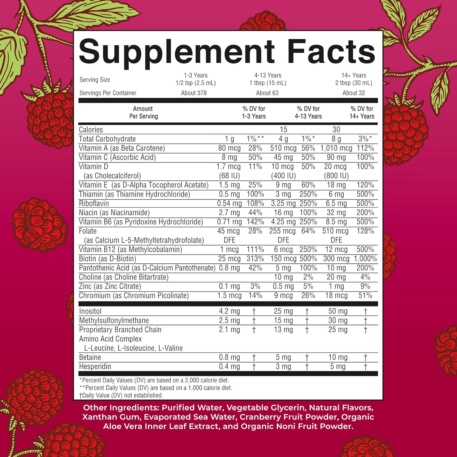
Designed the "Start Building Healthy Habits" A+ module with checkmarked benefit pillars and the Supplement Facts panel rebuilt as a clear, on-brand age/dose table.
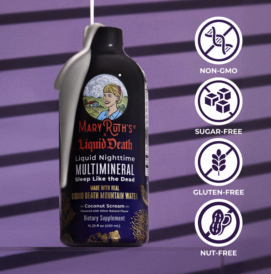
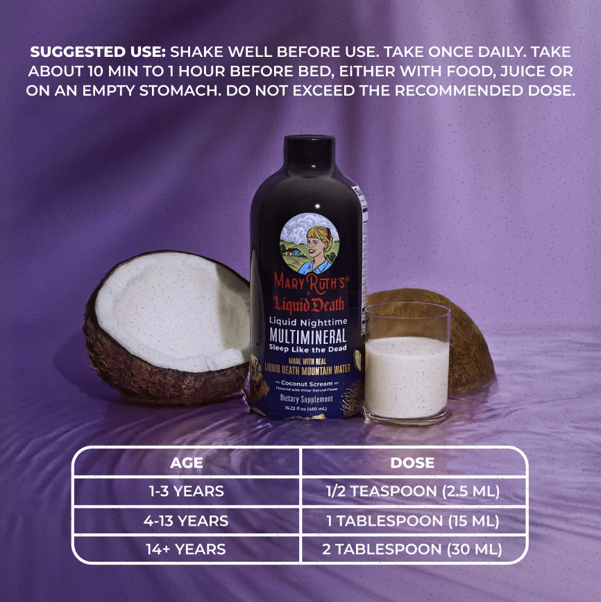
Art directed the MaryRuth x Liquid Death "Sleep Like the Dead" Nighttime Multimineral collab, carrying its purple-and-black world across free-from icons, benefit callouts, and a suggested-use layout.
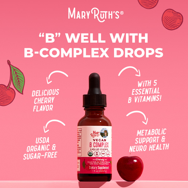
Created the "Pineapple Dream" product photography and image stacks alongside the "B Well with B-Complex Drops" stack, giving each flavor its own color-coded story.
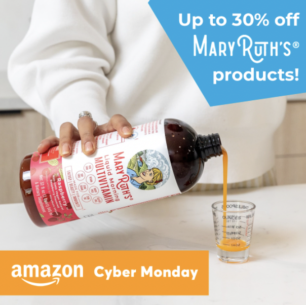
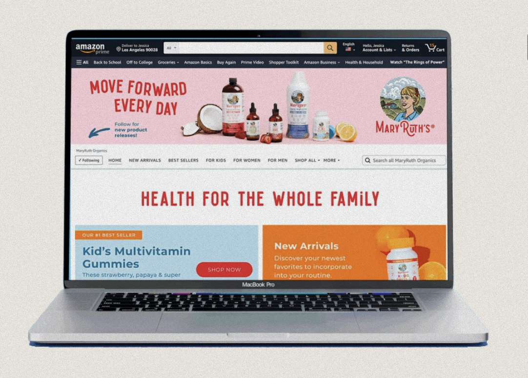
Designed promotional and merchandising creative, the Cyber Monday ad units and the "Health for the Whole Family" storefront, so the brand stays cohesive from ad impression through the full shopping destination.