Branding & Packaging for Sheeeeeeets
Sheeeeeeets needed a brand confident enough to make people smile instead of squirm. I built the identity around a wobbly, stretched "SHEEEEEETS" wordmark and a playful "Silent Scent Solution / Filter the Funk" voice, then designed a gradient pouch system that turns the whole category into something genuinely fun to reach for.
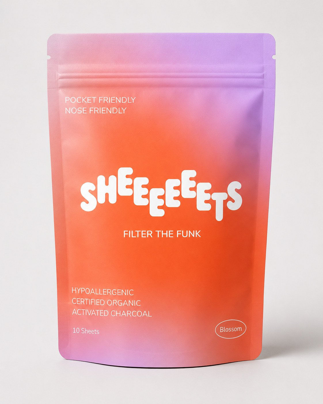
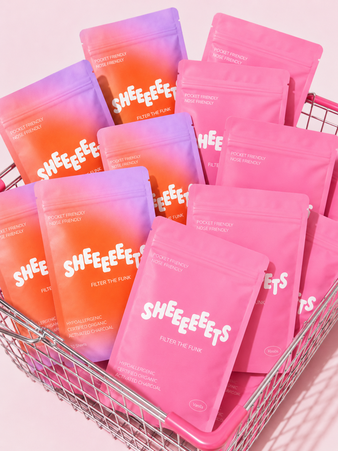
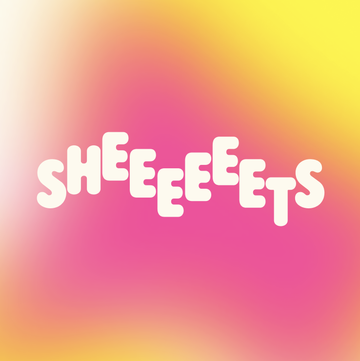
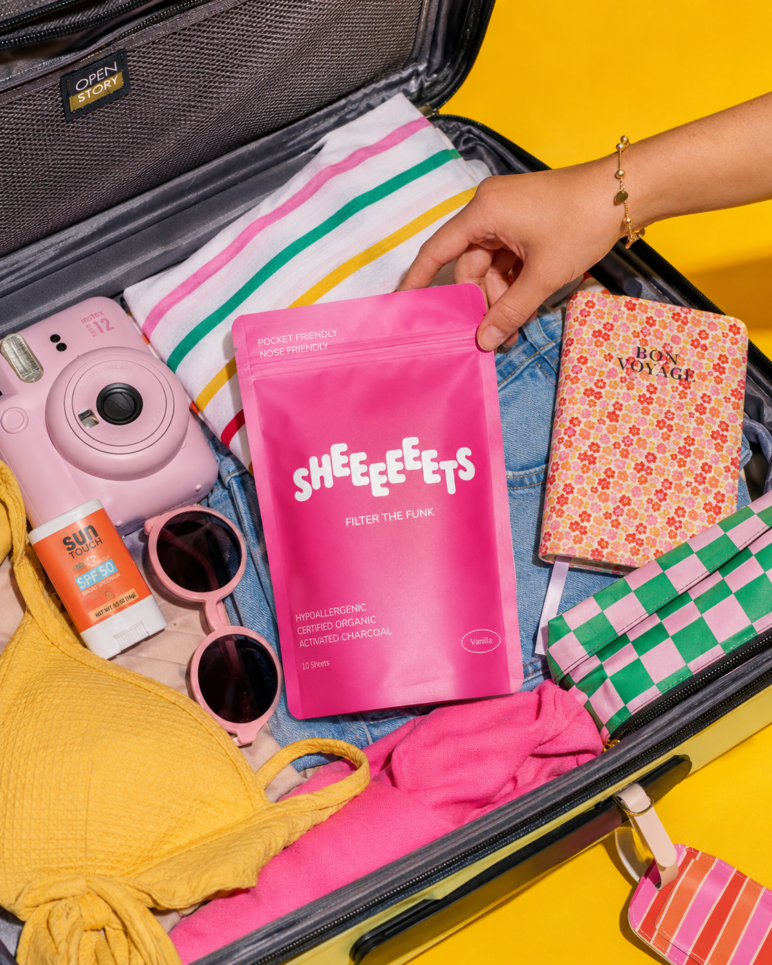
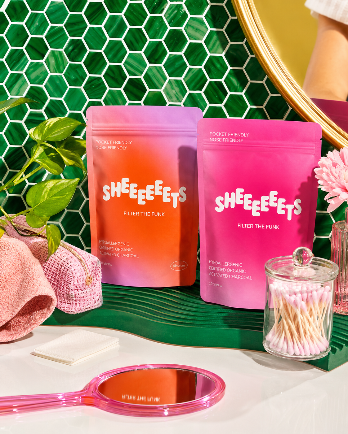
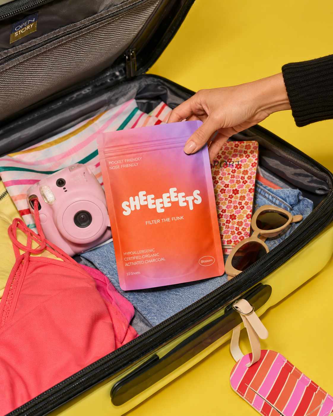
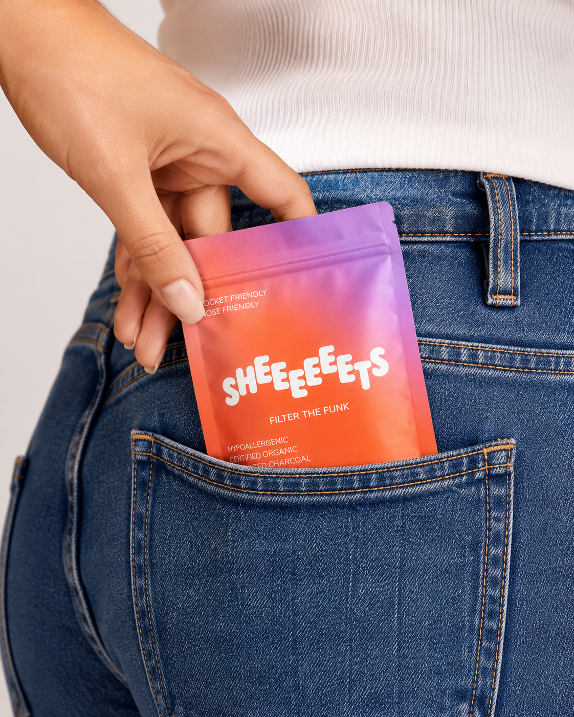
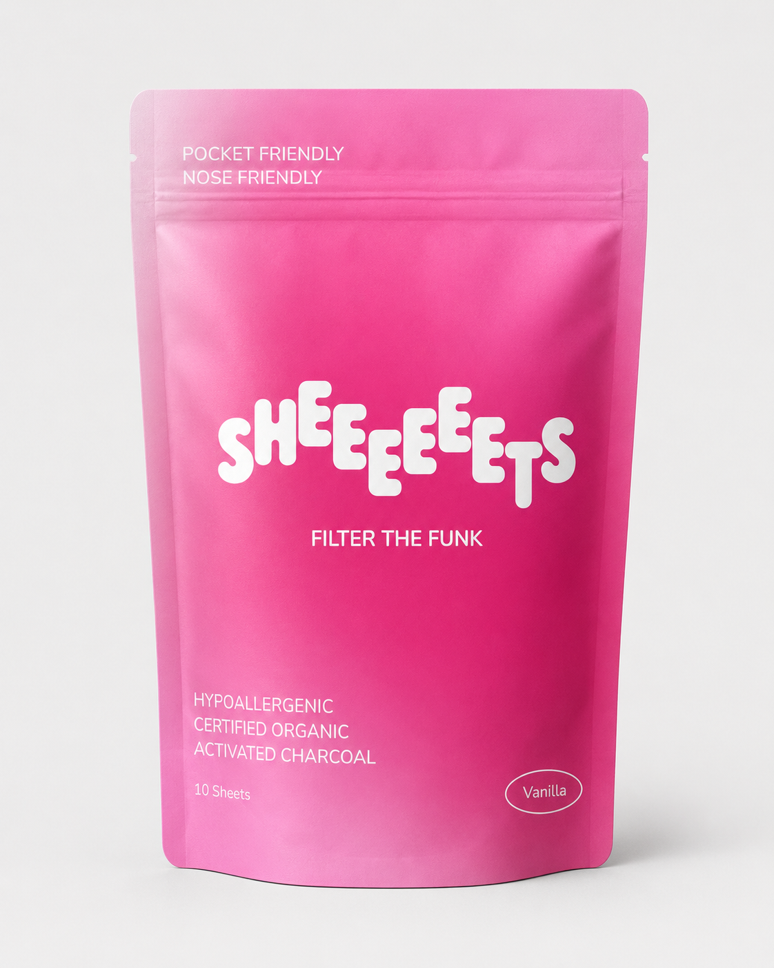
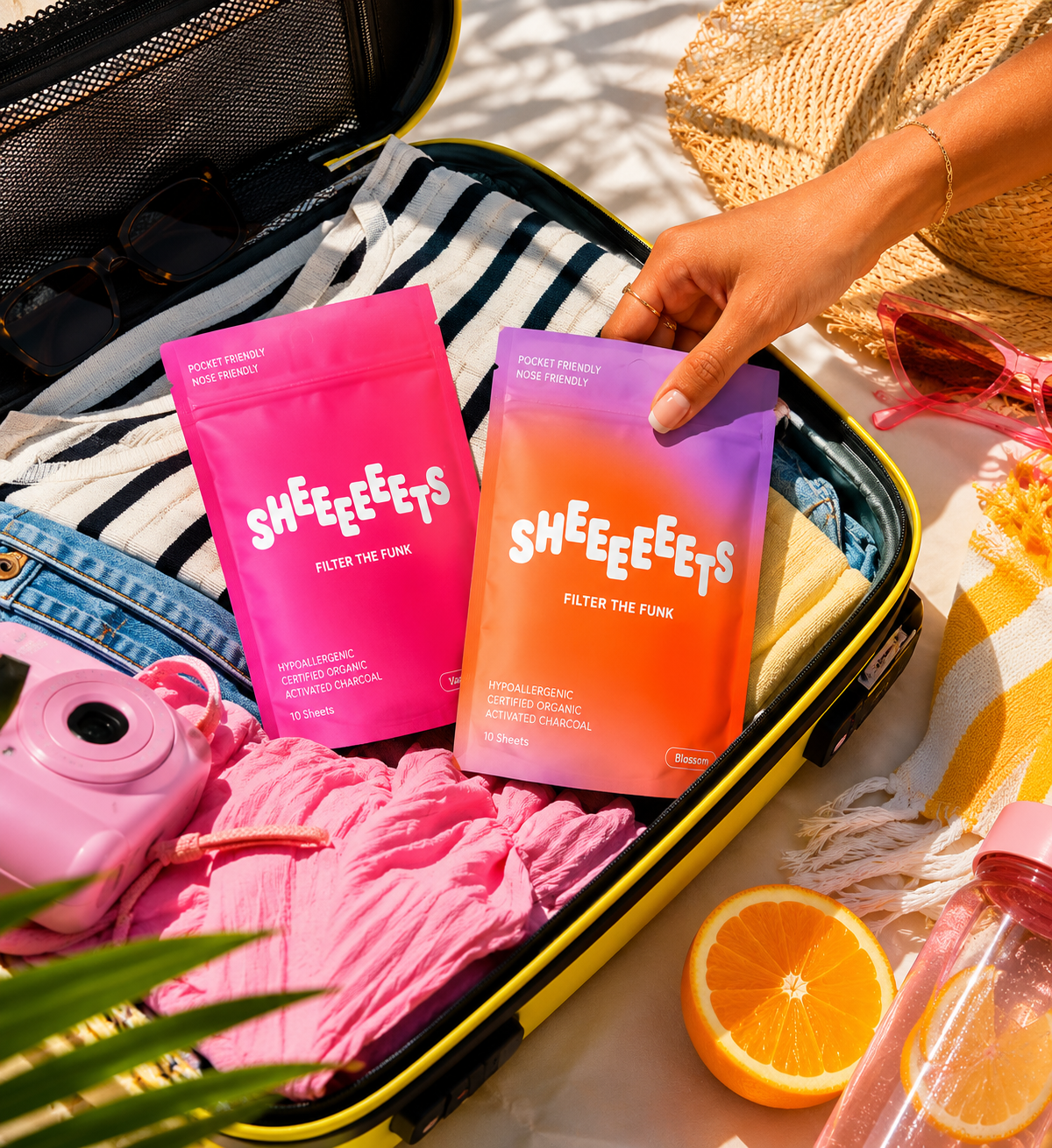
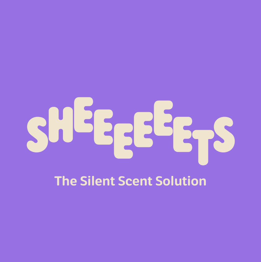
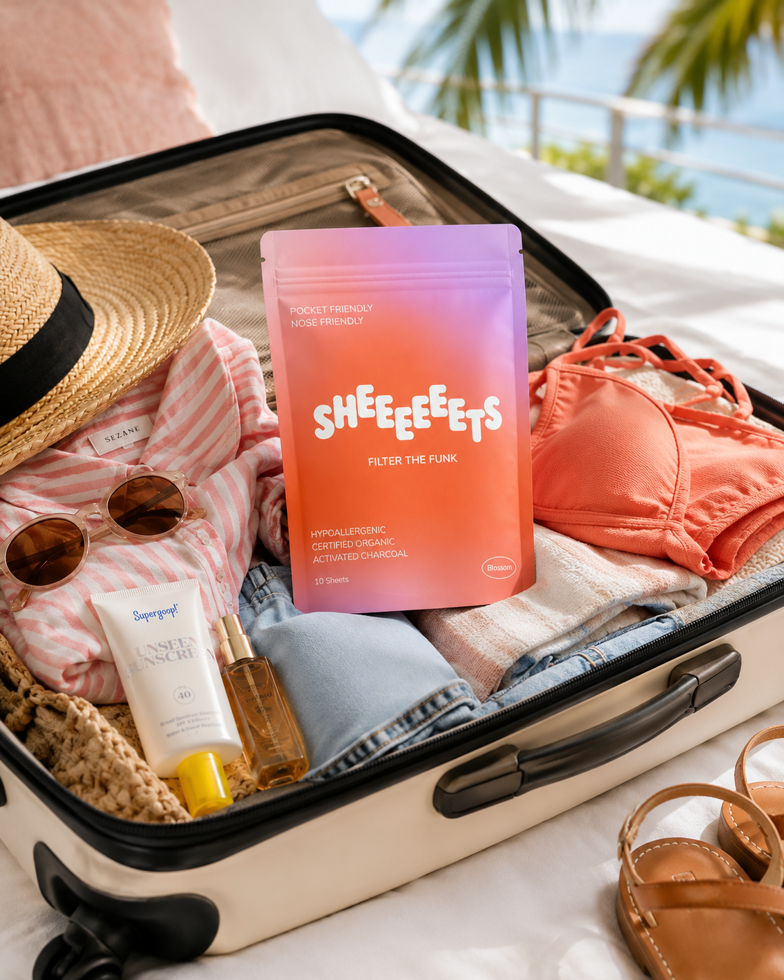
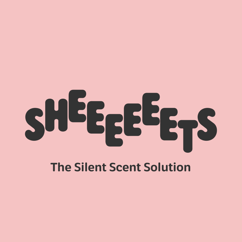
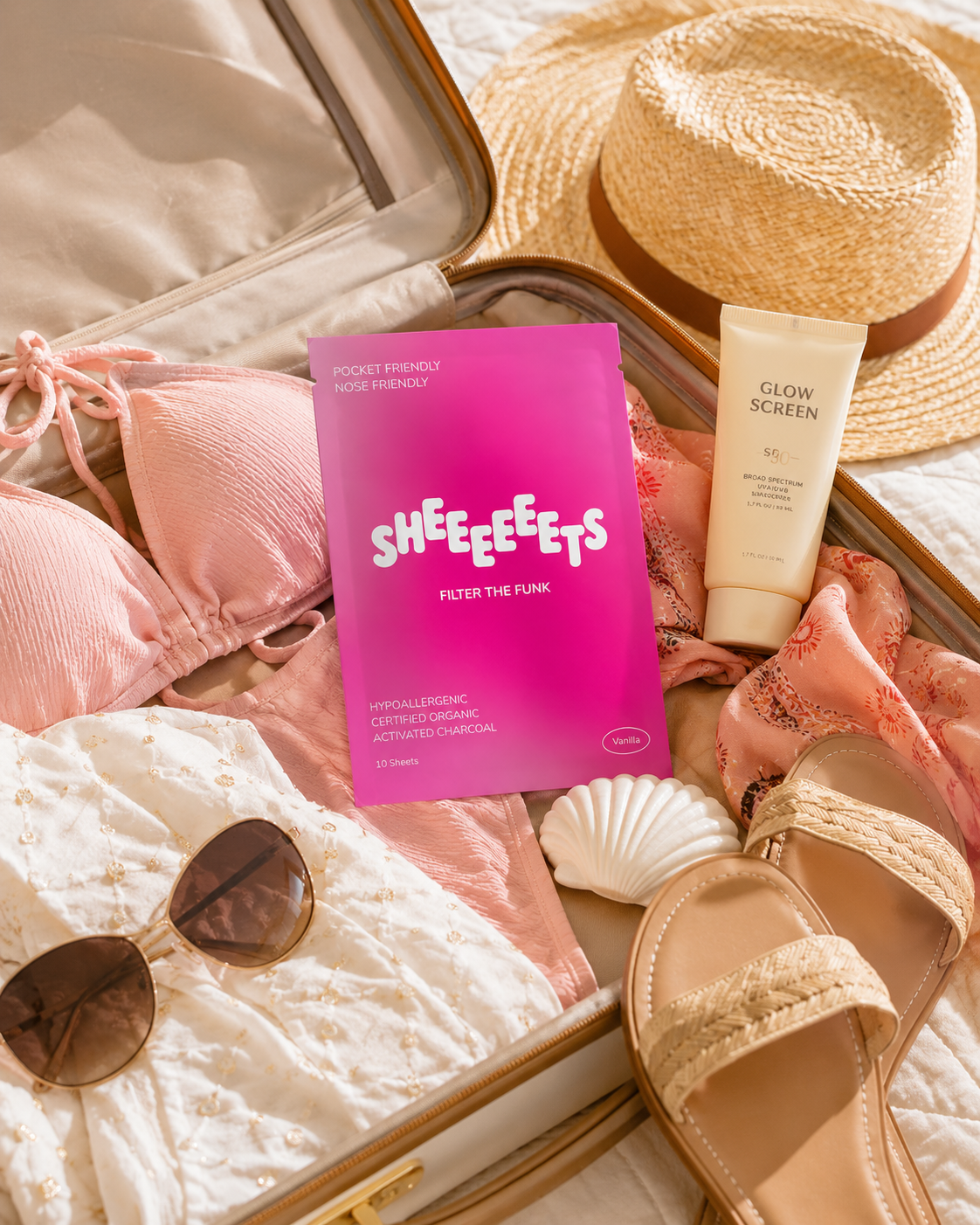
Designed the Sheeeeeeets identity around a bouncy, irregular wordmark, the stretched run of E’s does the comedic heavy lifting, paired with cheeky brand lines like "The Silent Scent Solution" and "Filter the Funk" that lean into the humor without ever being crude.
Built a flexible logo and color system that flexes across blush, periwinkle, and sunset-gradient backgrounds, so the brand can shift tone, soft and clean or loud and funky, while staying instantly recognizable.
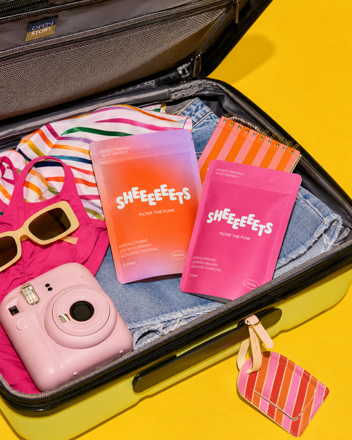
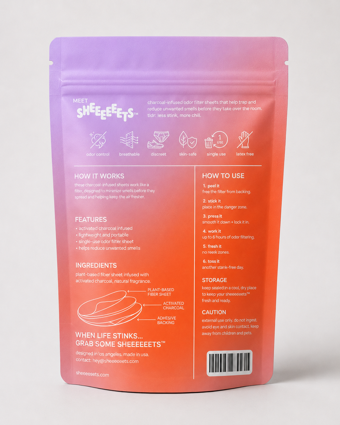
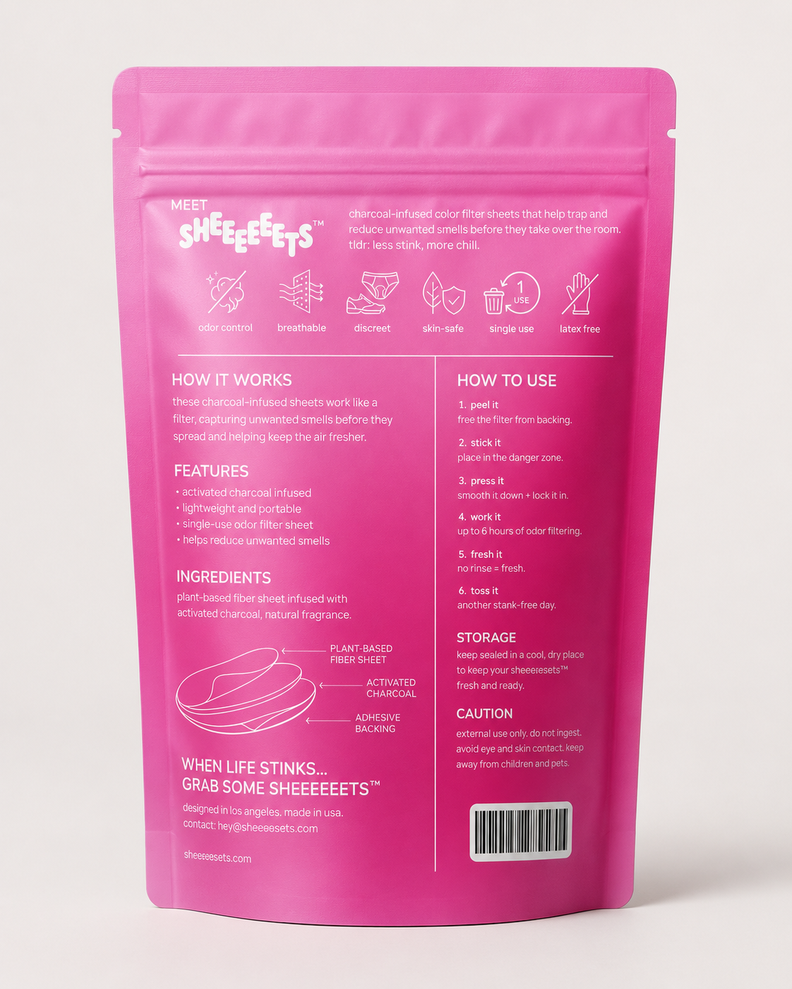
Designed the pouch packaging in two scent-coded directions: a hot-pink "Vanilla" and a purple-to-orange "Blossom" gradient, each leading with the wordmark and a confident "Pocket Friendly / Nose Friendly" line.
Wrote and laid out the full back-of-pack system, a clean icon row plus a numbered "peel it / stick it / press it / work it / fresh it / toss it" sequence that keeps the cheeky voice running all the way through the fine print.
Art directed lifestyle imagery that reframes the brand as a travel essential, the pouch tucked into a sun-soaked suitcase alongside sunscreen, sandals, and swimwear, to make the whole category feel aspirational and giftable.